AI Site View
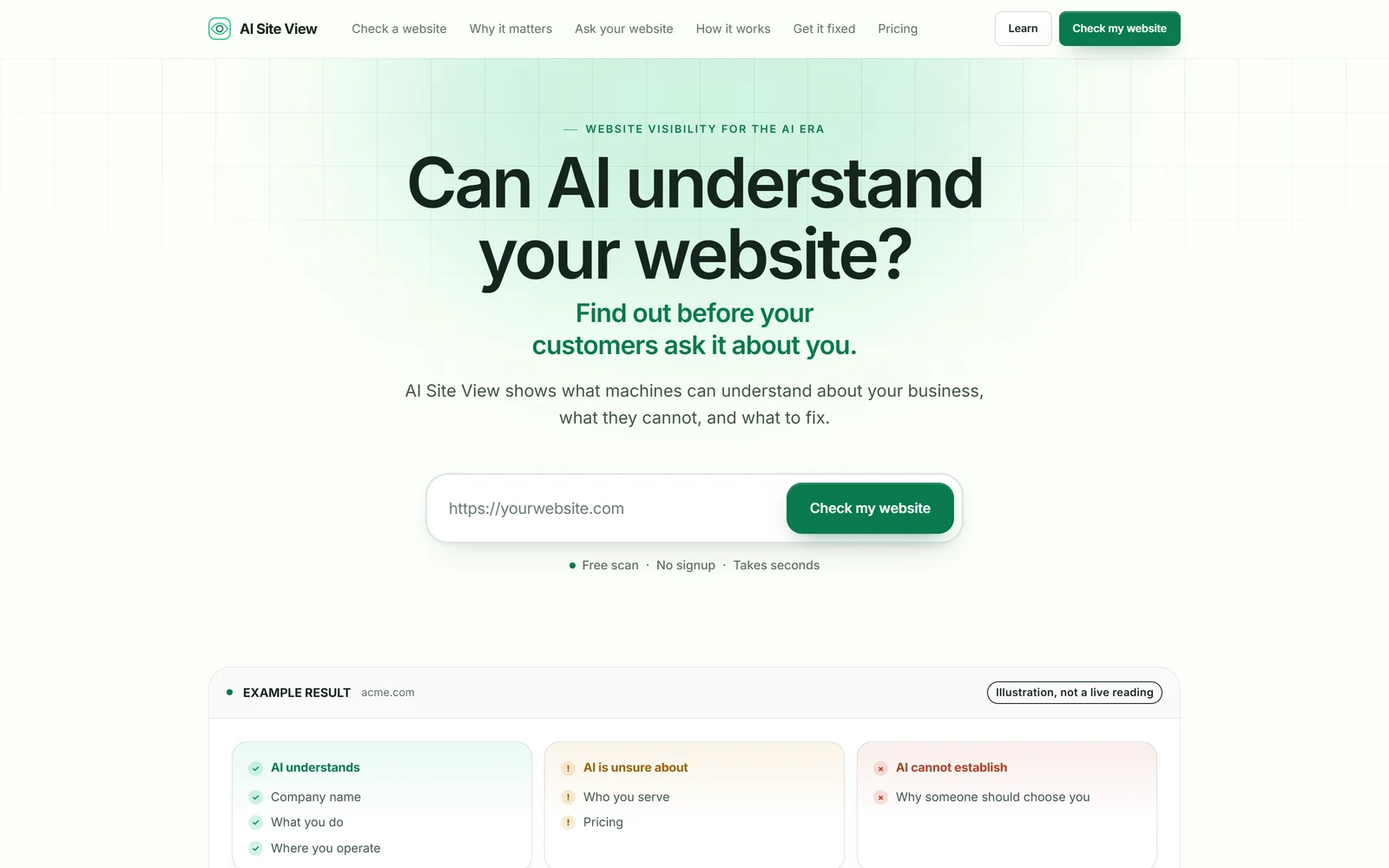
A diagnostic that runs before it asks for anything. Give first, then ask. The pattern we recommend to almost every founder with a technical product.
- Product strategy
- Brand
- Diagnostic UX
- Development
Founders, technology companies and new products
For founders and technology companies whose product is good and whose website is not yet doing it justice.
The usual problem
The four failures we see most often on startup sites, all of which cost you signups.
An AI-powered platform for modern teams. Every visitor now has to work out what you actually do, and most will not bother.
Your product is genuinely good in a live walkthrough. On the website it is three screenshots and a feature list, and none of the magic survives.
An email field and a promise. Nobody signs up for a promise. They sign up after they have seen something that made them want it.
Enterprise buyers read a website for signals of durability. Most startup sites accidentally broadcast the opposite.
What we build
We will push hard on the one sentence at the top. It is the highest-leverage thing on the site and usually the least worked-on.
The product performing itself: real interface, real output, the moment it becomes obvious. Feature grids come after that, if at all.
Give something before you ask. A working demo, a real answer, a diagnostic. Then the email field is an easy yes.
Security, uptime, data handling, who is behind it. Say the things a cautious buyer needs before they will book a call.
Premium, fast, and used to make the product legible rather than to decorate. Never at the cost of a mobile load time.
Startups rewrite their homepage constantly. We build so you can, without breaking the layout or waiting on us.
Why we understand this
Most studios have never shipped a product of their own. We have shipped several, which means we have written a headline that did not work, watched a waitlist not fill, rewritten it, and watched what changed.
That is a different kind of useful. When we argue for cutting a section or leading with the demo, it is not an aesthetic preference. It is what happened last time.
Most of the work in our portfolio is ours: AfterRaise, AreaIQ, AI Site View, RareTrial, FreeTeleprompter, The Job Well Done and Pageant Calendar. Each is labelled Shika-built, so you always know which is which.
Proof
Different audiences, different visual languages, all shipped and live.
A diagnostic that runs before it asks for anything. Give first, then ask. The pattern we recommend to almost every founder with a technical product.
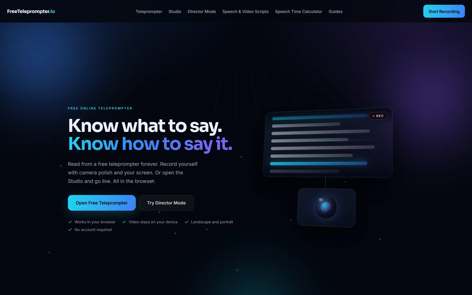
A free utility with no signup, where the product runs entirely in the browser. Positioned on a single promise and built to be used within five seconds of landing.
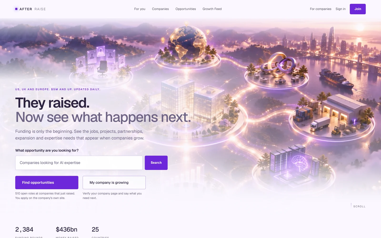
A consumer product built on an idea rather than a category tree, with a visual language nobody would mistake for anything else in its market.
Start a project
A Loom, a staging link, a deck, or five minutes on a call. If we can see it working we can work out how to sell it.
Every project is scoped individually. Once we understand what you need, we will give you a clear fixed proposal before work begins.