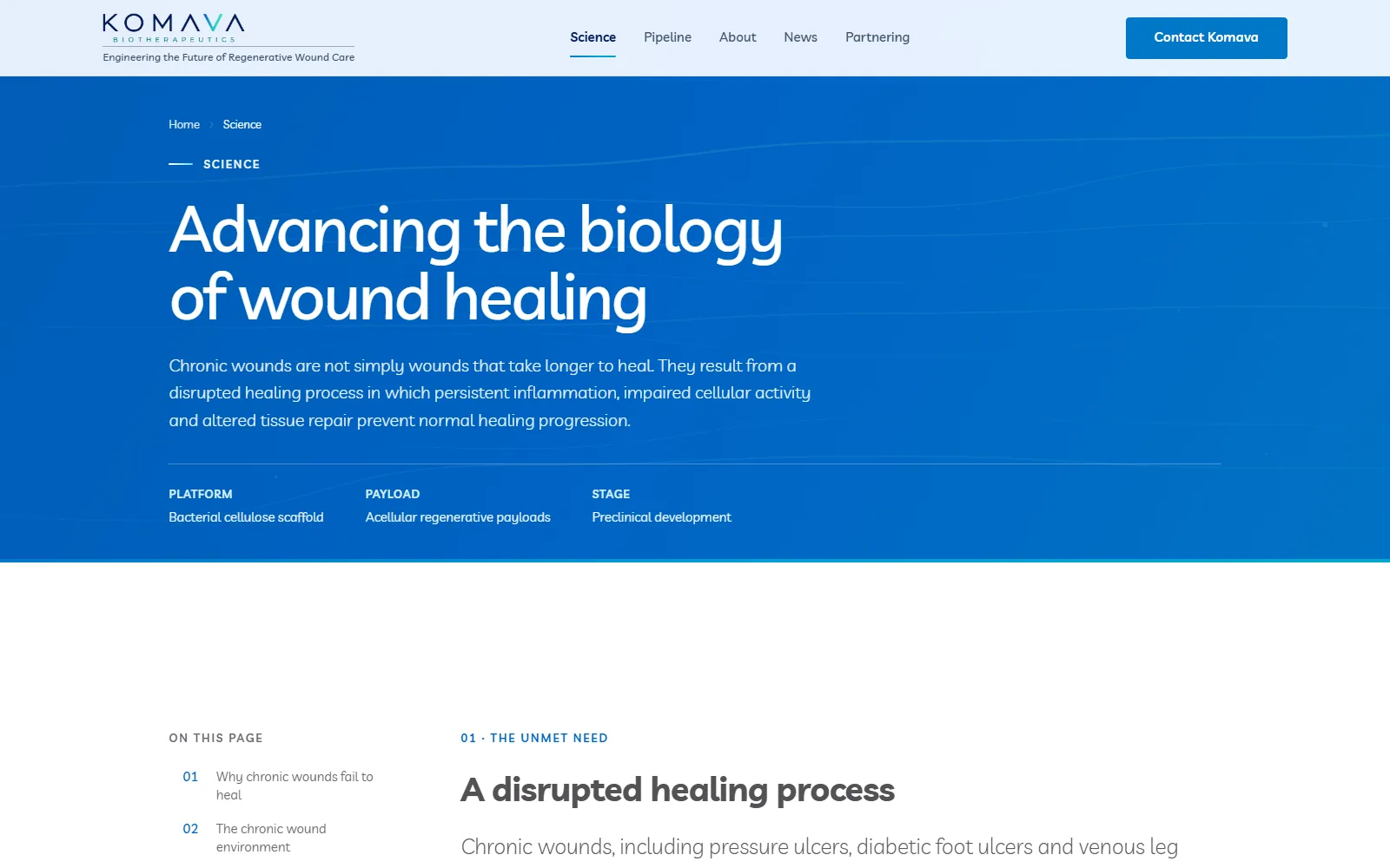
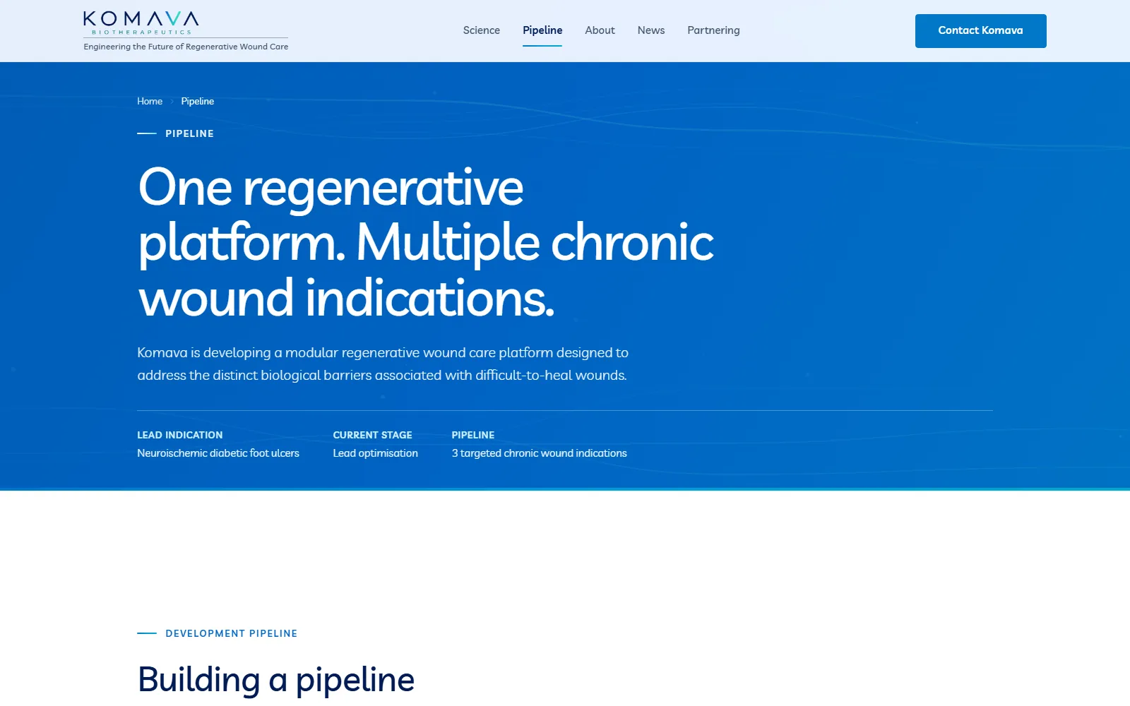
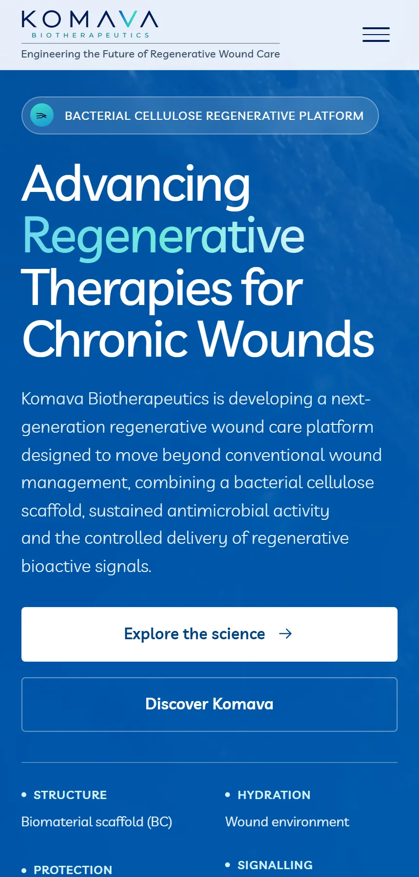
Komava Biotherapeutics
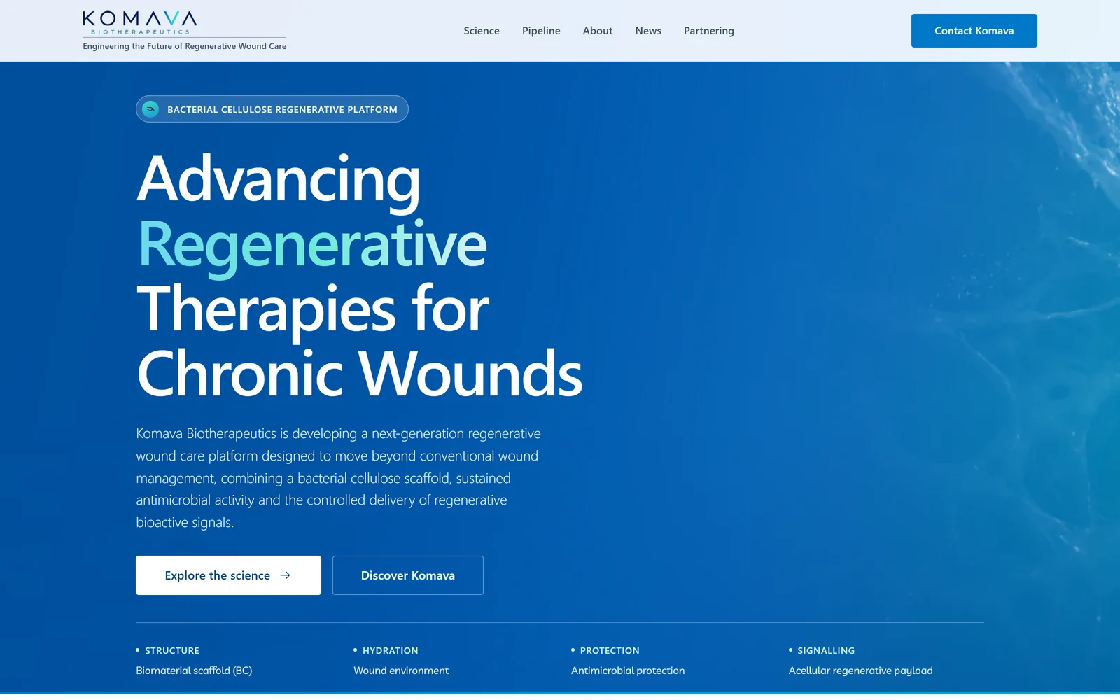
Building a modern corporate presence for a Swiss biotechnology company working at the frontier of bacterial cellulose based therapeutics.
- Client
- Komava Biotherapeutics
- Sector
- Biotechnology, regenerative wound care
- Location
- Switzerland
- Engagement
- Client project, 2026
- Scope
- Strategy, structure, design, development, motion, scientific storytelling
- Delivered
- A twelve-page corporate site, live on the client’s own domain and hosting they control
- Live at
- komavabio.com
The client
A preclinical company with real science and no digital presence.
Komava Biotherapeutics is developing a regenerative wound care platform built on a bacterial cellulose scaffold, combining a biomaterial structure, sustained antimicrobial activity and the controlled delivery of regenerative bioactive signals.
The science was well advanced. The digital presence was not. When the project began the domain served an empty storefront, and the company’s entire public story existed as a pitch deck and a content document.
The brief
Three sources, no codebase, no design system.
We were given a non-confidential pitch deck, a five-page website content document, and later the client’s own one-page site. That was the whole starting position: no prior code, no brand guidelines, no photography library, no icon set.
This is the situation the studio is built for. A sophisticated organisation does not need to arrive with a polished brief. It needs someone who can take what exists and turn it into something they can react to.
The challenge
Two readers, one page, and claims that carry real risk.
The direction
The client’s own visual language, made systematic.
Rather than impose a studio house style, we took the typographic pairing and the clinical blue the company had already chosen and built a proper system around them: a full type scale, a colour system with tested contrast, a spacing rhythm and a component set.
The result reads as Komava rather than as a template with a logo dropped in, and it gives them somewhere consistent to put everything they publish next.
The experience
Motion used only where it explains something.
Three of the scientific figures are films rather than diagrams, because a scaffold, an antimicrobial mechanism and a delivery concept are genuinely easier to understand in motion than in a static illustration.
Everywhere else the site is quiet. There is no scroll-jacking, no decorative animation and nothing that moves for the sake of moving. A partner reading the pipeline page at eleven at night should meet a document, not a demo reel.
The build
Fast, accessible, and structured so the client can maintain it.
The site is content-driven: the pipeline, indications, team and news all come from structured data files rather than being typed into pages, so a programme can move forward or a biography can be corrected without touching layout.
Media URLs are content-fingerprinted, so a replaced image is actually seen by returning visitors rather than being hidden behind a year-long cache. Accessibility was tested rather than assumed, including the cases automated tools quietly skip, such as text over gradients and text inside video.
The whole site was then handed over to hosting the client owns and manages, with written instructions for the one DNS change that mattered, so their mailboxes were never at risk during the move.
The result
Live, indexable, and theirs.
Komava now has a twelve-page corporate site covering the science, the pipeline, the company, partnering, news and the legal set, live on their own domain and discoverable by search engines and AI answer engines.
We are not going to quote you a conversion uplift. Nobody has one for a preclinical biotechnology company six weeks after launch, and anyone who shows you one made it up. What we can point at is the thing itself: a company that had no usable website now has one that a partner, an investor or a future employee can be sent to without hesitation.
The wider point for anyone reading this from a serious scientific company: Komava gave us a deck, a document and a fair amount of trust. They did not need to know how to design a website.