UX and UI design for web platforms and appsIf it needs explaining,
it needs redesigning.

We design websites, web platforms and apps so the next step is obvious: the right first screen, flows with fewer steps, accessible by default and tested on a real phone. Then we build it, so what you approve is exactly what ships.

The usual problem

Beautiful mock-ups. Confusing product.

Most design work stops at a picture. The picture is approved, someone else builds it, and the thing people actually use ends up somewhere between the two. Four patterns we see again and again.

01

The first screen asks before it gives

A sign-up wall, a tour, a form. The visitor has not seen anything worth signing up for yet, so most of them leave at the door.

02

Every flow has a step nobody needs

A confirm screen that confirms nothing, a field you never read, a choice that could have been a sensible default. Each one costs you people.

03

It was designed on a large monitor

It looked superb in the review meeting. On a phone, on a train, with one thumb, the button is below the fold and the text is too small to read.

04

The design and the build drifted apart

Spacing guessed, states never designed, the empty screen and the error message left to whoever got there first. Six months on, every page looks slightly different.

What we design and build

Design that makes the thing obvious to use.

For a marketing site, a SaaS product, a booking flow, a member area or a children's app. The deliverables are concrete, and every one of them ends up in the working product.

The right first screen

One job per screen, decided before any styling. What the visitor needs to understand in the first few seconds, and the single action that should follow.

Flows with steps removed

We map each journey end to end, then cut. Fewer fields, better defaults, value shown before anything is asked for in return.

Every state, not only the happy one

Empty, loading, error, first visit, returning visit. The screens most teams forget are the ones that decide whether people trust the product.

Accessible by default

Contrast, readable type, visible focus, keyboard paths and motion that respects the reduced-motion setting. Built in from the first screen, not bolted on after an audit.

Tested on a real phone

Designed phone first, then checked on an actual handset before you see it. Thumb reach, tap size, text size and load time, in the hand rather than in a browser window.

A design system you keep

Colours, type, spacing and components defined once, documented and handed over, so the next page your team adds already looks like it belongs.

Why design and build together

What is designed is what ships.

A UX agency that only designs hands you a file. A development team then interprets it, under a deadline, and makes a hundred small decisions the designer never sees. That is where good products quietly get worse.

We remove the gap. The people who decide how a screen should work are the people who build it, so the spacing, the states, the transitions and the small reassurances survive into the real product. When something turns out to be awkward in the hand, we change the design and the code in the same afternoon.

It also means you review a working thing, not a picture of one. You tap through the real flow on your own phone, which is the only honest way to judge whether it is obvious to use.

Pretty mock-ups are easy. A product people understand without help is the work. If you are turning a website into something customers sign in to, see website to platform. If you are launching something new, see startups and technology.

Proof

Products we have designed, built and put in front of people.

Most of these are our own products, which means we live with every design decision after launch. Each one solved a different UX problem.

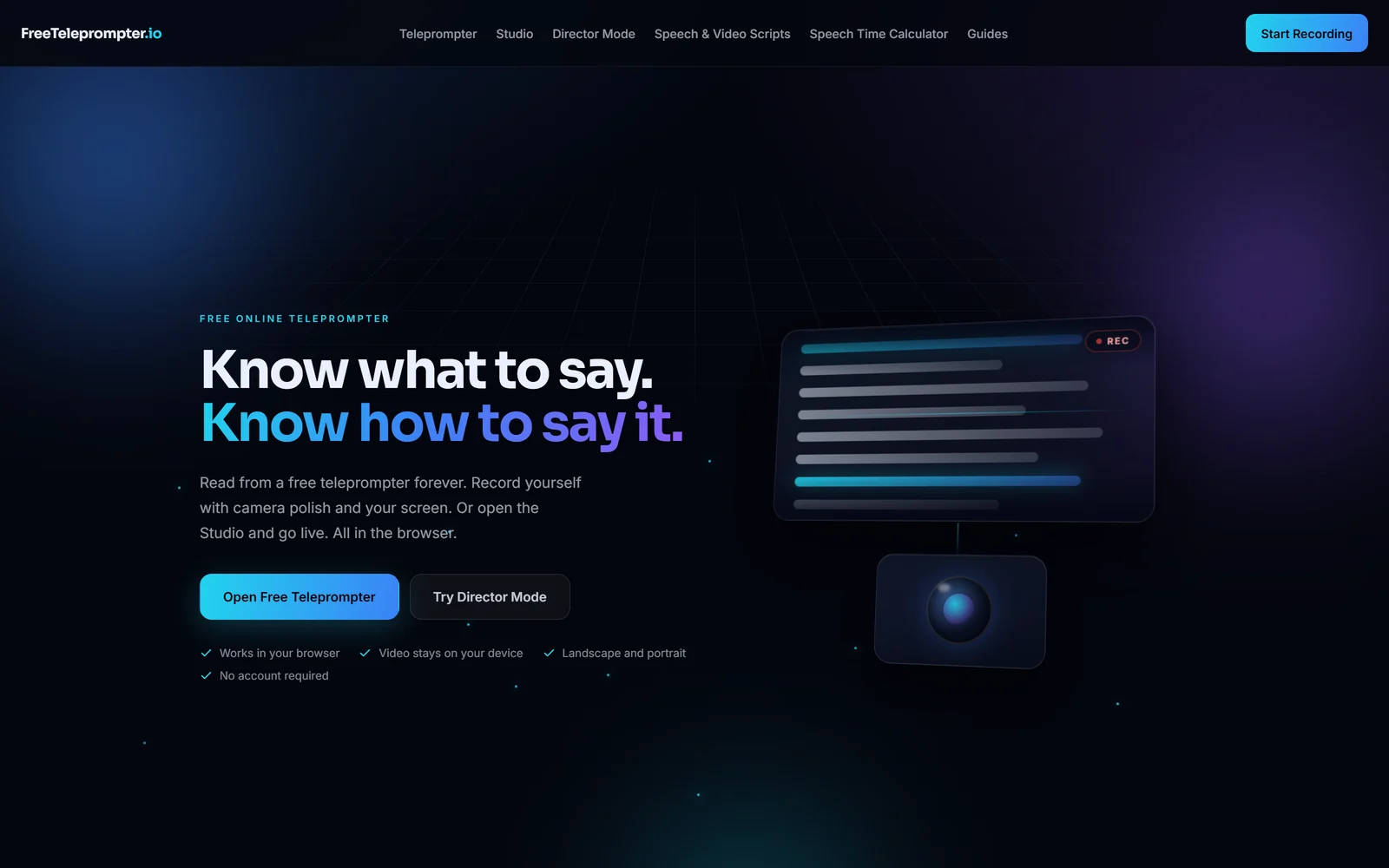
The FreeTeleprompter homepage: a deep navy page with a lit teleprompter product mock and a single start button
Shika-built Creator tool·No sign-up

FreeTeleprompter: from landing to recording in about five seconds

A free teleprompter that records straight to camera in the browser. No sign-up, no installation, and nothing uploaded. Every field and onboarding step between landing and using was treated as a cost, and removed.

  • Product design
  • First-screen UX
  • In-browser recording
  • Development
The AreaIQ platform: a company enters its website address and gets the developments that may create opportunity or risk for it
Shika-built Intelligence platform·Global

AreaIQ: making a machine judgement readable in under a minute

One entry point, a company address. Every score expands to show exactly what matched, so a person can disagree with it. Fact and interpretation are separate fields and look different on screen, and every claim carries its source beside it rather than in a footnote.

  • Information architecture
  • Intelligence UX
  • Source transparency
  • Visual system
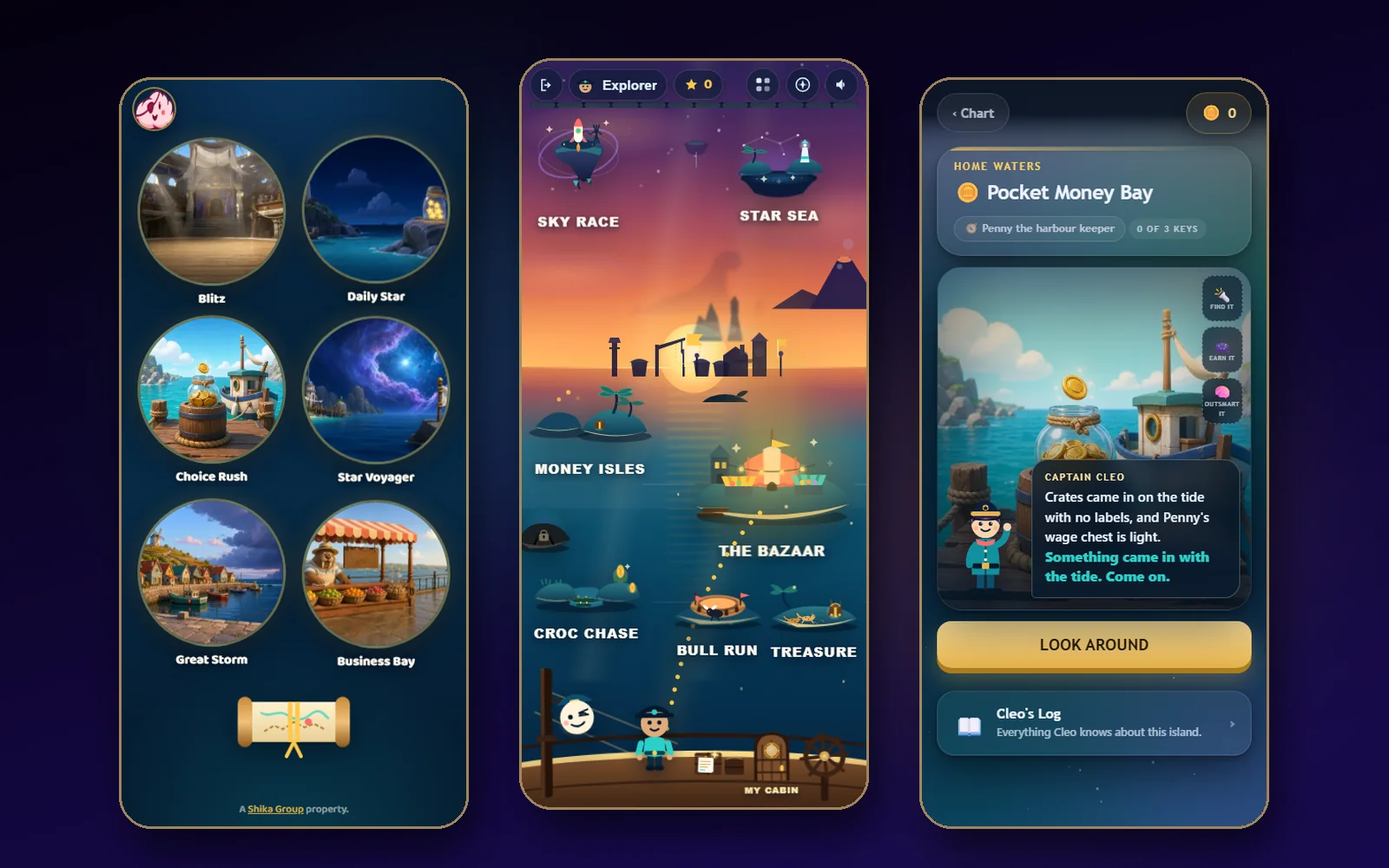
Captain Cleo on three phones: the first six games, the harbour a child returns to, and the first money island
Shika-built Learning games·Ages 5 to 15

Captain Cleo: designed for children from five, on any screen

More than fifty games in one world, on a phone, a tablet or a computer. No login, no card and no adverts for the child. The chart a child taps is generated from a single registry, so no game can be left off the shelf by accident.

  • Children's UX
  • Navigation system
  • Game design
  • Development
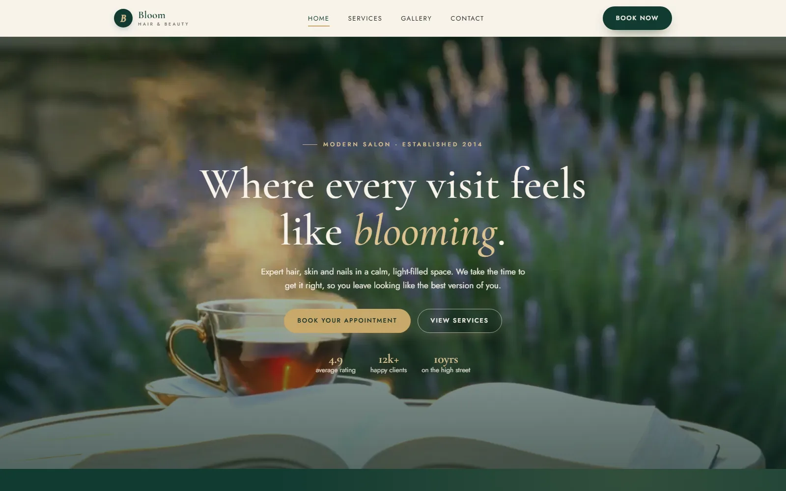
The Bloom Hair and Beauty homepage: a full-bleed salon film in emerald, ivory and brass, with booking always within reach
Studio demo Salons·Reference build

Bloom Hair and Beauty: booking on a phone, at midnight

A working four-page salon site we built so owners can judge a real thing instead of a description. Open it on a phone, tap through the treatment menu, which is readable text and not a PDF, and follow the booking route. It is a demo, and labelled as one.

  • Mobile booking flow
  • Readable price menu
  • Design
  • Development

We have also designed and built a paid membership platform where members sign in with a link sent to their email and see one personal next step on their dashboard. More in the portfolio.

How a project runs

You see it working before you pay in full.

01

A written read first

Send the site, the product, or three sentences about the idea. We come back in writing with where people will stall, what each key screen should do, and which steps can go.

02

A clear fixed proposal

What you get, what it costs and when, agreed before any work begins. No hourly meter running in the background.

03

See it working early

A real, clickable version on a private copy that you open on your own phone. You react to the product, not to a picture of it, and payment stages follow what you have seen working.

04

Launch, and the system is yours

The live product, the documented design system and a period of fixes after launch. Every account is in your name.

Common questions

Before you ask.

Do you only design, or do you build it too?
Both. The same studio designs and builds, so there is no handover gap where a design gets simplified by someone who was not in the room. What you approve is what ships.
Can you improve the UX of a product we already have?
Yes. We start with a written read of what you have: where people stall, which screens do too much, and which steps can go. Then we redesign the parts that matter most first, without rebuilding what already works.
Do you design for phones first?
Yes. Every screen is designed for a phone first and checked on a real phone before you see it, then widened for tablet and desktop. A layout that only works on a large monitor is not finished.
Is accessibility included?
Yes, from the first screen. Contrast, readable type sizes, visible focus, keyboard paths, real text instead of images of text, and motion that respects the reduced-motion setting are part of the design, not an audit at the end.
What do we keep at the end?
The working product, plus the design system behind it: colours, type, spacing and components defined once and documented, so your team can add a page or a feature later without the look drifting. Every account is in your name.
What does UX and UI design cost?
Every project is scoped individually. Tell us what you need and we will come back with a clear fixed proposal before any work begins.

Related: 3D and motion websites, new ventures, educational websites and everything Shika Studio does.

Start a design project

Send us the screen that confuses people.

A link, a screenshot or a sentence about where users get stuck is enough to begin. We will tell you in writing what we would change first, and why.

Every project is scoped individually. Once we understand what you need, we will give you a clear fixed proposal before work begins.